The new standard is there is no standard.
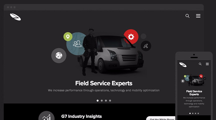
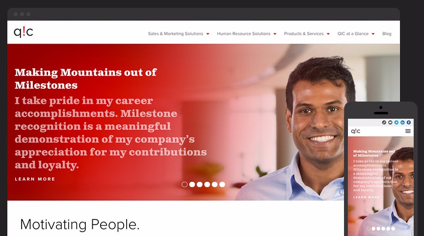
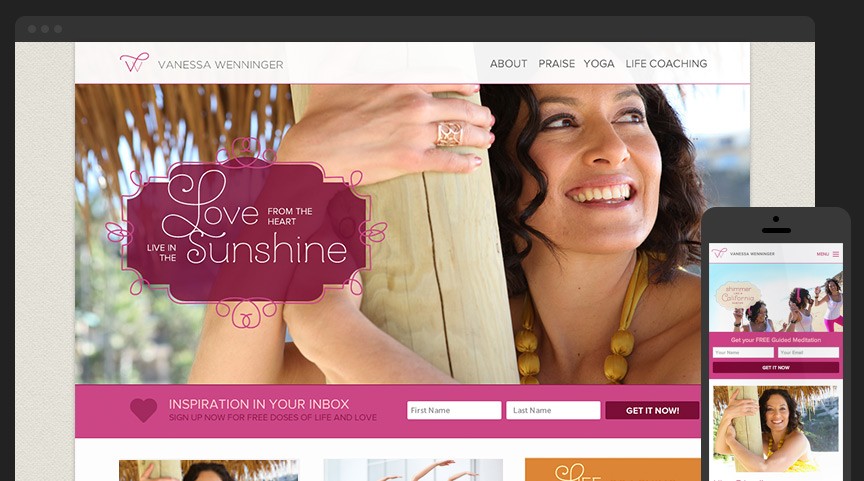
Designing for a single specific screen size and reaching a majority of your customers is now an impossibility. Responsive web design allows for the crafting a great user experience that is not shackled to the way in which it is viewed.
Solid Foundation
All of our responsive projects start with Foundation, the most advanced responsive front-end framework in the world.
Rapid Prototyping
Your progress update is only a click away. We create live wireframes allowing you to see how your site will behave on any device.
Mobile First
Every site is built with small devices as a top priority, never an afterthought or add-on. We scale things beautifully from there.