Pegasus needed a brand that was all about the waves.
Born from a simple desire to share the world’s most beautiful surfing locations, Pegasus Lodges & Resorts needed a clear identity that reflected the quality of experience they provided.
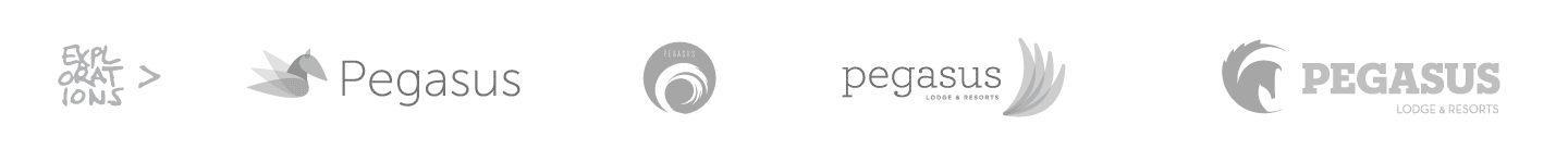

All About Movement
More than anything else, Pegasus wanted to capture a feeling of movement within their mark. We created multiple designs varying from the literal to the abstract all with the idea of momentum in mind.
Room to Grow
A key factor in the selection process was choosing a logo mark that would lend itself well to the possible expansion of the company into the Snowboarding Market. Options were created to show how an umbrella identity might work including a general mark, surfing mark and snowboarding mark. Because resorts for snowboarding would have overlap with skiing as well, the marks were focused on location (mountain/water) rather than any particular sport.
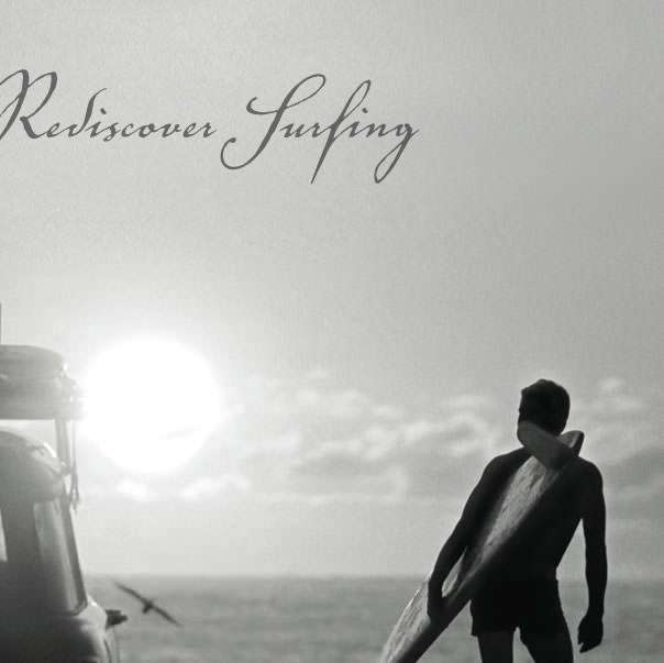
Extending the Brand
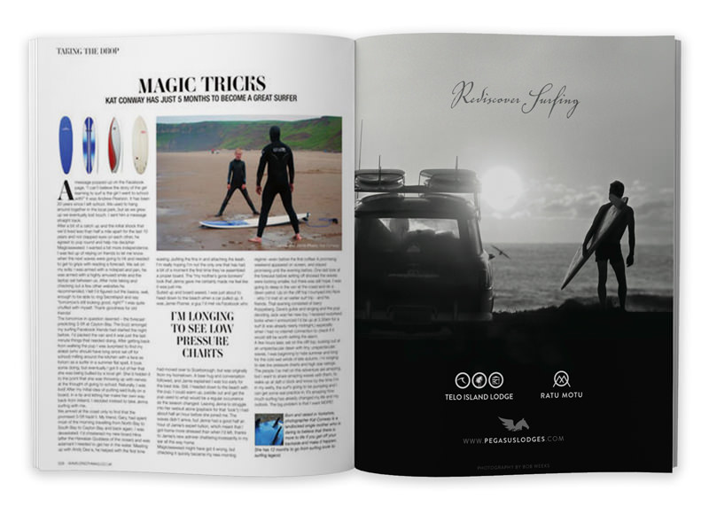
Pegasus needed a quick turnaround on advertising for a dual print/digital publication within the surfing market. We helped to extend the current brand with a design focusing on simplicity in execution allowing for beautiful black and white photography to take center stage. Photography was provided by Bob Weeks.